Design Focus: Harris Hotel by ILATAAJ
Interior design practice ILATAAJ designed modern and inventive interiors for Harris Hotel in Bekasi, Jakarta.

The presence of several multinational companies employing many foreign nationals have lent Kota Bekasi an interesting character. The city in the eastern border of Jakarta is among Indonesia’s most populous and progressive and has become a magnet for satellite cities. Among these is Summarecon Bekasi, a 240-hectare satellite city by well-established property developer PT Summarecon Agung Tbk. Our friends at Form magazine published this deep dive into the interior of the Harris Hotel here.
Summarecon Bekasi comprises residential and commercial developments, with facilities for education, health, leisure, and hospitality, among others. The mixed-use facility in the heart of the city incorporates a shopping mall, convention center, and the aforementioned hotel.
Harris Hotel & Conventions Bekasi has 332 guest rooms, including six suites, and a 3,000-sqm convention center with 12 meeting rooms and exhibition spaces; it is linked to the Summarecon Mall Bekasi. Managed by Tauzia Hotel Management, Harris Hotel was designed by Cadiz International Architect. Its interior spaces were designed by ILATAAJ.
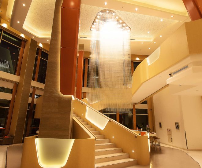
“We accentuated the raw structural columns and cores with plain fibre cement plank cladding. We also created a series of ‘armours’ made of curved composite metal panels, and laid them on the structural elements to round out the edges and give it a more refined feel,” Tirta continues. They selected a hue that is close to the Harris brand color for this.
The interiors have two main highlights: a grand staircase and a custom-made chandelier (pictured top). Installed in the double-height space that connects the lobby and the restaurant, right beyond the main entrance, these two elements define the space while heightening the sense of arrival. “We deliberately exaggerated the length and curve of the staircase to achieve animated vistas around the chandelier as one travels between the two floors,” Tirta says. “The bar counter at ground level is incorporated into the staircase in one continuous strip that turns seamlessly into a balustrade above. Meanwhile, special lighting is created by illuminating a composition of numerous solid, cylindrical glass segments.”
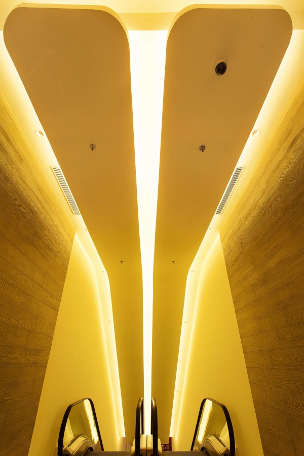
Overhead, Tirta points out, one can see a clever manipulation of the ceiling. In some areas, linear cove lighting at ceiling height serves as navigational tool that leads guests from the lifts to the lounge, the mall, or the lobby. The various layers comprising the ceiling – a plain white base, a large surface for acoustic absorption, and linear planes that serve as base for the downlights – are suspended from different heights. These dropped surfaces all fold back vertically for a strong upward sweep and maximum opening towards glazed facades.

The layering of surfaces evident in the hotel, seen here both above and below, gives everything a futuristic look, offset by the warm tones throughout
Story Credits
By Marc Almagro


